Level 3 Photography and Photographic Practise
Thursday, 3 September 2015
Tuesday, 8 July 2014
Movie poster
Thursday, 3 July 2014
Photography website
For the end of term project we were instructed to put our best photos up onto a website.
For this task I uploaded mine on to Flickr its a fun, easy, and simple website to share your photos with the world.
https://www.flickr.com/photos/125854739@N02/
For this task I uploaded mine on to Flickr its a fun, easy, and simple website to share your photos with the world.
https://www.flickr.com/photos/125854739@N02/
Monday, 23 June 2014
Thursday, 24 April 2014
Movie posters
Before creating my own movie poster, I picked 3 movie posters which really appealed to me.


The first one is Star Trek into Darkness.
Good points about the Star trek into Darkness poster:
1. Back lighting
2.Center figure in the middle of the poster
3. Eye catching background
4. Big bold title font
5. Very scenic poster
The second one is World War Z.
Good points about the World War Z poster:
1. Lots to look at within the poster
2. Big bold unique title with colors
3.The main character is at center point of the poster
4. The use of the lighting is very effective in the poster
5. Different views of different objects. I.e. close up of the main character and the helicopter,
but yet you have a birds eye view of the city.
The third and final one is Alien vs Predator.
Good points about the Alien vs Predator poster:
1. Its a very simple but yet effective poster
2. Shows both of the characters mentioned in the title
3. Black and bold title
4. The page is divided in a way that it keeps the poster looking interesting
5. Not a colorful poster which gives it that horror black and white effect which it is trying to create.
Monday, 31 March 2014
Thursday, 28 November 2013
Basic Photo shop tools
For the bird photo we used the heal tools. The spot healing brush tool which erases a piece of the picture which you select. We also used the healing brush tool which select a part of the picture you want them you can mirror that same part of the picture some were else in the picture.
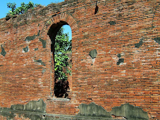
For this brick work picture we used the patch tool. The patch tool allows you to select a picture, dragged that part of the picture, and mirror another part of it allowing you to cover up the part you have selected so it blends in with everything else.

For this photo shop picture all I have simply done is add another layer on top of one.
For this picture I got a picture of the Hulk then added added broken glass onto another layer and blended them in together. This is giving the effect that the Hulk is smashing the glass on the screen.
Some of the quick tools I used for this are:
Control and T to select and re size the photo.
Holding down shift to keep the picture blurred when re sizing it.
The Crop button.
In this section I have a few images where I used basic photo shop tools. Ranging from the lasso tall, which is a free hand tool where you draw around an image or shape and it crops and allows you to move it. To the brush tool to draw around the outline of an image to give it that bolder effect.
In this first picture I made a rough copy of a fitness magazine. This image includes a ripped version of Albert Einstein. All I simply did in this photo was crop and re-size some of the images to fit them on the front of the cover to make it look vaguely look like the begging of a front cover of a magazine.
In this photo of Sully all I was simply doing here was testing out the drawing aspect on a bamboo tablet. I used the paint brush tool, zoomed in and highlighted the edges of him to give him the bold effect.
In this "very comedic" picture of Alan Sugar I cropped Alan Sugars head re - sized it and then duplicated it. Simple as that.
Subscribe to:
Comments (Atom)


